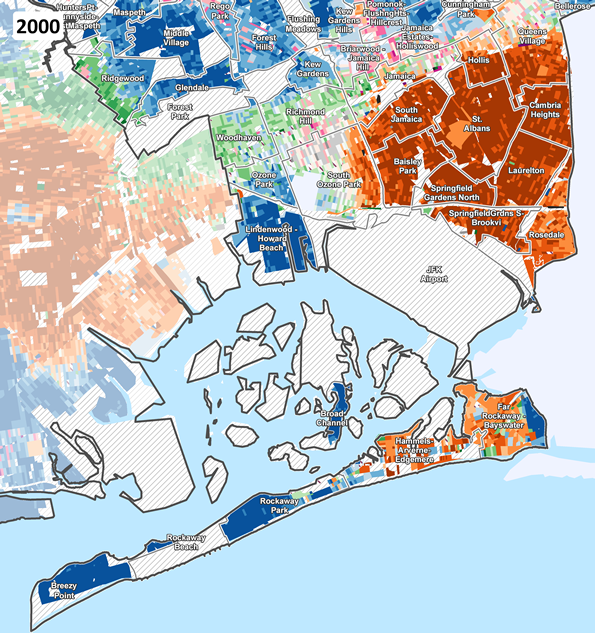
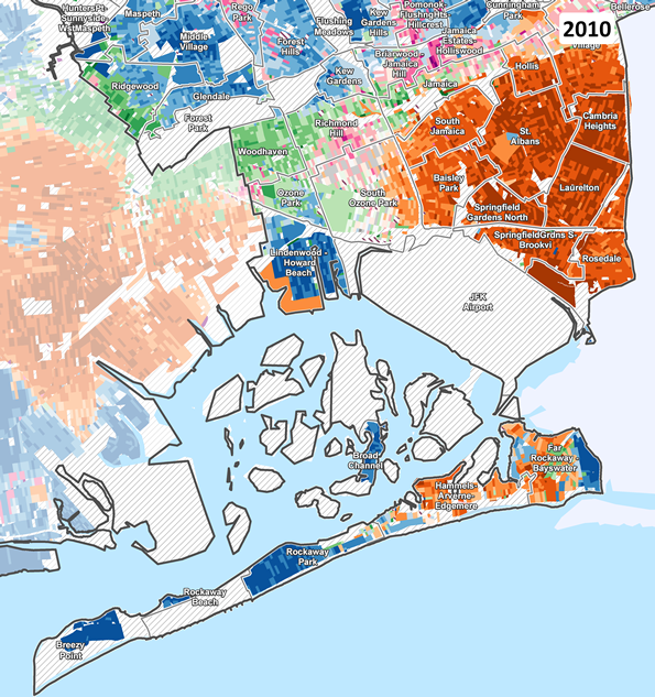
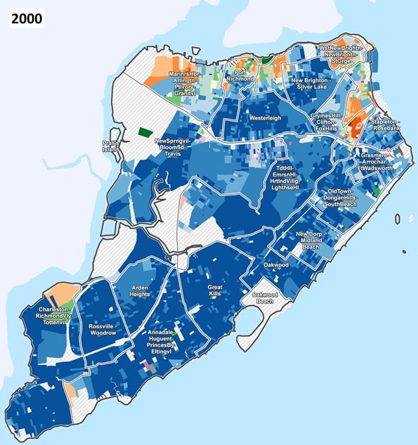
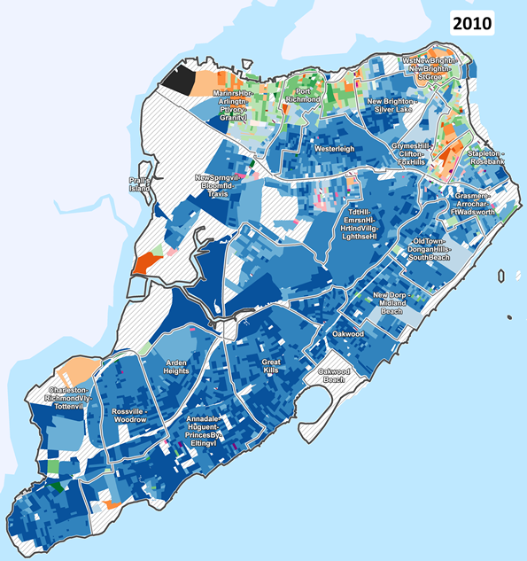
Block by block demographic changes mapped across New York, 2000 to 2010
The maps below compare changing race/ethnicity patterns in the last decade, Census block by Census block across New York City. (Blocks are the smallest areas for which the Census Bureau tabulates population data. They average 270 people in NYC, and often correspond to a city block.) These small areas of Census geography enable us to visualize detailed patterns of change.
CONGRESSIONAL REDISTRICTING: Given the recent interest in the fate of New York's Congressional District 9 in the redistricting that will take place before the 2012 elections, CUR has created a special version of its race/ethnicity change maps. Click here to view how predominant race/ethnicity patterns have changed from 2000 to 2010 across Brooklyn and Queens, the two NYC boroughs spanned by CD 9.
Click here for a discussion and analysis of the city's demographic changes in the last decade. (Includes an interactive table of race/ethnicity population changes for all neighborhoods in the city, sortable by number and percent change between 2000 and 2010.)
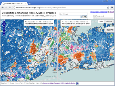
Also try our zoomable maps, allowing you to zoom in to specific blocks, click on individual blocks to see population details, and easily move around New York City and other major metropolitan regions -- all while sliding back and forth to compare 2000 and 2010 race/ethnicity patterns on a block-by-block basis. Click the image to launch the maps!
For now the maps and data focus on 5 major race/ethnicity categories; later this summer the Census Bureau will release data at the block level for Hispanic and Asian subgroups and detailed age breakdowns and other characteristics.
Analyzing the data block-by-block is useful because New York City's neighborhoods can change block to block. This fine-grained geographic and demographic view of the city is interesting for anyone curious about how the city's population is changing, but is especially important for public policy debates. Will a new legislative district boundary include or exclude a small but growing ethnic community? Will social services need to be redistributed? Do emergency preparedeness plans account for new groups that may have different language requirements?
How to use the maps
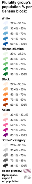
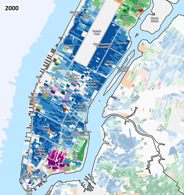
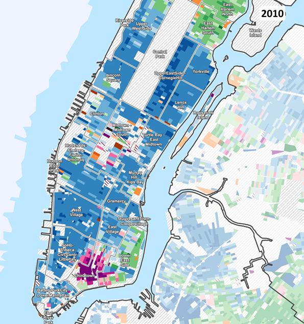
The maps below use a relatively new interactive technique to easily compare images (in this case, maps) from one time period to another. Each map focuses on one of the 5 boroughs. The maps "on the left" show the block-level race/ethnicity plurality patterns based on the 2000 Census. The maps "on the right" show the plurality patterns based on the 2010 Census. The legend next to the maps describes how the colors represent population percentages in each Census block. Special thanks to www.catchmyfame.com for the code to implement the comparison tool.
IMPORTANT NOTE: In blocks where the racial/ethnic group constitutes a plurality with a relatively low percent of the population, the block is shaded with a lighter color on the map. This indicates a more mixed population from a race/ethnicity perspective. Blocks with higher plurality percentages (darker shading on the maps) have a more homogenous population dominated by a single race/ethnicity group.
Note that mapping the plurality patterns may somewhat overstate the level of racial/ethnic segregation in some areas of the city. Even where the population is mixed, the maps only show one color shading. Another approach, such as "dot density" makes it easier to see the mix of population groups (for example, see the New York Times maps here). But it is easier to show change in density over time with color shaded Census blocks than with dots. We encourage your feedback and suggestions for improvement along those lines.
Each map focuses on a different borough. Areas in the other boroughs are greyed out, and the color shading in these greyed-out boroughs should not be confused with the color patterns for the borough of interest.
Click and hold the green slider in the middle of the map to drag the slider to the left or right so you can easily reveal the changing population patterns between 2000 and 2010.
- Dragging to the right reveals the 2000 map.
- Dragging to the left reveals the 2010 map.
- Click the links below each map to quickly show one or the other.
Also try our zoomable maps, allowing you to zoom in to specific blocks, click on individual blocks to see population details, and easily move around the New York City metropolitan region -- all while sliding back and forth to compare 2000 and 2010 race/ethnicity patterns on a block-by-block basis.
The maps and data provided by CUR provide a window into many different narratives and analyses of demographic trends throughout the city. We encourage you to use our materials to illustrate and examine these stories by repurposing our maps and data for your own websites, blogs, publications, and studies. Please contact us if you have any questions about our work, or if we can help in any way.
The data
Below is a link to the geographic file we used for the NYC maps. Please feel free to use the data in your projects. If you use the information, please credit the "Center for Urban Research, CUNY Graduate Center" in your work. Thank you.
- NYC block shapefile with 2000 and 2010 population attributes and plurality codes [7 MB zipped file];
For more information, contact the CUNY Mapping Service (cunymapping [ at ] gc [ dot ] cuny [ dot ] edu at the Center for Urban Research, CUNY Graduate Center. Thanks!
"BEFORE AND AFTER" MAPS
Comparing predominant race / ethnicity by block in 2000 & 2010
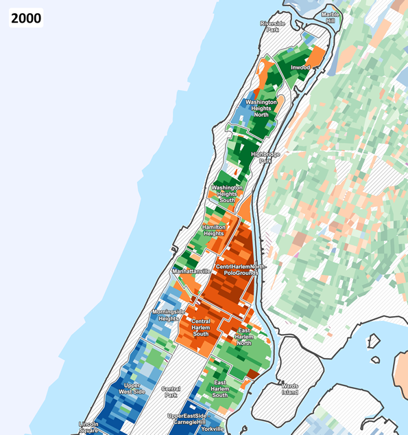
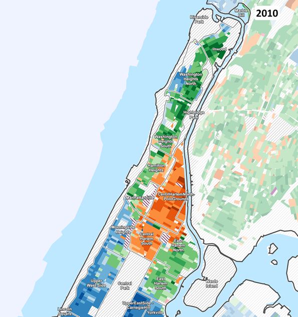
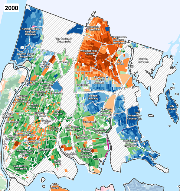
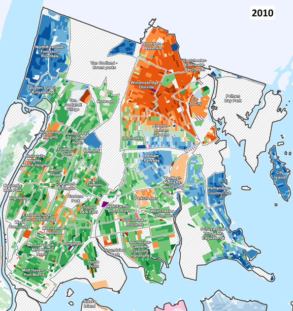
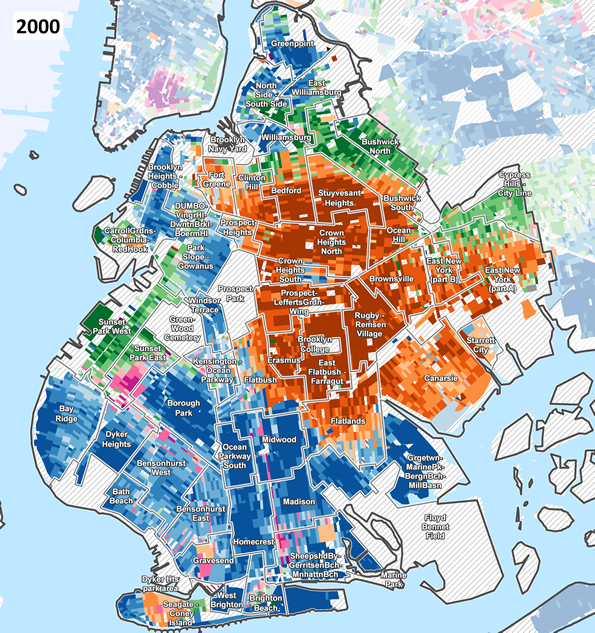
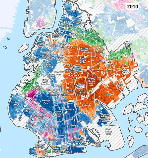
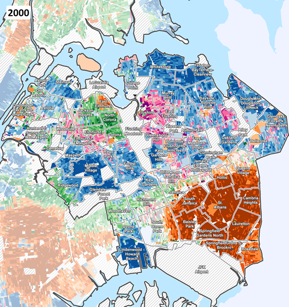
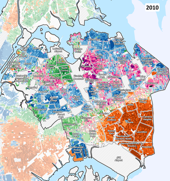
NOTE: Neighborhood areas are NYC Dept of City Planning "Neighborhood Tabulation Areas". See DCP website for description.