The project involved several components:
- calculating and analyzing the block-level (and also neighborhood-level) plurality race/ethnicity data;
- joining those attributes with block and neighborhood geography (shapefiles) and mapping the results;
- applying the "before and after" slider feature to the maps and incorporating all the pieces into this website.
The data
For this analysis, the Center for Urban Research calculated race/ethnicity plurality for a given area (such as neighborhood, tract, or Census block). Plurality of the population refers to the group with the largest number of people (not necessarily the majority) -- in other words, the predominant subgroup of the area's overall population.
Note that this narrative refers to "race/ethnicity groups" based on the major categories from the US Census. We used the Census Bureau's mutually exclusive race and Hispanic origin categories as follows: 1) non-Hispanic White; 2) non-Hispanic Black; 3) Hispanic/Latino; 4) non-Hispanic Asian; and 5) all other persons (representing non-Hispanic people who checked two or more races, Native Americans, Hawaiians, or some other race). Throughout this narrative when we refer to White, Black, Asian, and others, we are referring to non-Hispanics. As the Census Bureau points out, people who identified themselves as Hispanic on the census form can be of any race.
The Census Bureau's block geography changed between 2000 and 2010 -- new blocks were created, blocks were merged, and block boundaries were modified in many places. In order to compare population data from 2000 and 2010 using a common set of blocks, we used the Census Bureau's block relationship file to allocate 2000 population counts to 2010 geography.
We then calculated the number and percent of people in each of the 5 major race/ethnicity groups (listed in the note above) for each Census block in the city for 2000 and 2010. From there we used the statistical software package SPSS to identify the group with a plurality of each block's population.
The maps
We exported this file in DBF format and joined it to the Census Bureau's block file in shapefile format from the Bureau's 2010 TIGER/Line shapefiles, a nationwide data set representing Census geography.
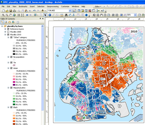
In order to create separate color shaded maps for each of the major race/ethnicity groups, we used ESRI's ArcGIS mapping and spatial analysis software (see screen shot at right) to:
- create a map layout for borough-level maps at the same scale for 2000 and 2010 population patterns,
- make 7 copies of the Census block shapefile (for each of the 5 race/ethnicity groups, a 6th for blocks that had no plurality -- the population for at least two groups in the block was the same -- and a 7th for blocks that had no population),
- set a definition query on each copy of the block shapefile using the PLURAL00 and PLURAL10 codes (see metadata in the shapefile) - this ensured that the color shading for the blocks would be mutually exclusive and the percent ranges for each color scheme would represent the block-level population percentages only for the blocks with each group's plurality,
- use ColorBrewer.org for the color schemes -- we needed to ensure that the color schemes for the 5 major race/ethnic groups would be distinct enough within each color (light to dark shading) and for displaying adjacent blocks with different pluralities -- for example, if a lightly shaded purple block was next to a lightly shaded green block, and
- export each map at the same resolution and dimensions so they would work seamlessly with the "before and after" image slider feature.
Note that we used the choropleth mapping technique -- applying light-to-dark shades of the same color to represent low to high population percentages block by block. This approach perhaps overstates the level of racial/ethnic segregation in some areas of the city, because even where the population is mixed, the maps only show one color shading. For example, the race/ethnicity distribution for a given block might be 22% Hispanic, 21% White, 20% Black, 19% Asian, and 18% "other". The plurality, therefore, is Hispanic. The block would be shaded light green on our maps. Does the single color to mark that block, even though it's a light shade, give the impression that the block is populated by a single population group? Our hope is that the light shading gives a visual cue that the area is more mixed than homogenous. (In 2010 there were only 420 Census blocks in New York City where the plurality population was less than one-third of the block's total population; in 2000 there were 516 of these blocks.)
Another approach, such as "dot density" (for example, see the New York Times "Every City, Every Block" maps) makes it easier to see the mix of population groups. But it is easier to show change in population proportion over time with color shaded Census blocks than with dots. We encourage your feedback and suggestions for cartographic improvement along those lines.
The website
We had seen the "before and after" image comparison technique -- using your mouse to drag a slider back and forth over two images at a website -- used for visualizing the impact of natural disasters, for example, in the New York Times and other media websites. We realized this would be a powerful technique for showing the block-level demographic changes on maps from 2000 to 2010. Luckily a web developer at www.catchmyfame.com had modified the technique using simple but powerful JavaScript code (using jQuery). The code is available as a jQuery plugin.
We also used the jQuery plugin "Tablesorter" to create the sortable tables showing population change by neighborhood.
Credits
Funding for much of the Center's recent work on Census issues has been provided by the Building Resilient Regions Project of the John D. and Catherine T. MacArthur Foundation, the Hagedorn Foundation, as well as support from the CUNY Graduate Center and the City University of New York.
Several people provided feedback and helpful editorial suggestions on earlier versions of the maps and narrative. Though the materials at this site were prepared by the Center for Urban Research, those invdividuals improved our work. We greatly appreciate their contributions.
The files
Below are links to the files we used for our maps and narrative. Please feel free to use these in your projects. If you use them, please credit the "Center for Urban Research, CUNY Graduate Center" in your work. Thank you.
- NYC block shapefile with 2000 and 2010 population attributes and plurality codes [7 MB zipped file];
- Excel spreadsheet of neighborhood-level population change from 2000 to 2010.
For more information, contact the CUNY Mapping Service (cunymapping [ at ] gc [ dot ] cuny [ dot ] edu at the Center for Urban Research, CUNY Graduate Center. Thanks!